What your product page leaves the buyer to figure out
A sofa can fit the room and still fail to reach it. How to make dimensions, delivery promises, and compatibility details useful before someone buys.
Research and ideas for better buying experiences
10 articles
Start with the unanswered question, not another purchase button. A product page needs to explain the specific item, the conditions of buying it, and what happens when it is unavailable or unsuitable.
Make the details comparable and explain what “fits” means before someone commits.
A sofa can fit the room and still fail to reach it. How to make dimensions, delivery promises, and compatibility details useful before someone buys.
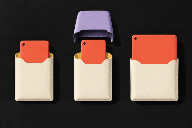
Help buyers confirm exact product compatibility, including model versions, required extras and unknown matches, before adding an accessory to the cart.
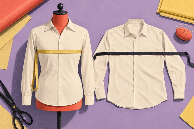
Build size guides that distinguish body and garment measurements, explain how to measure and keep product-specific fit guidance close to the size choice.
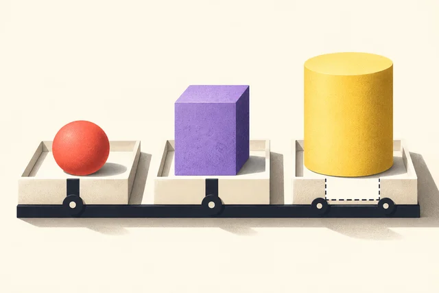
Turn inconsistent product specifications into a useful comparison with normalized units, clear unknowns and a buyer-centered worked example.
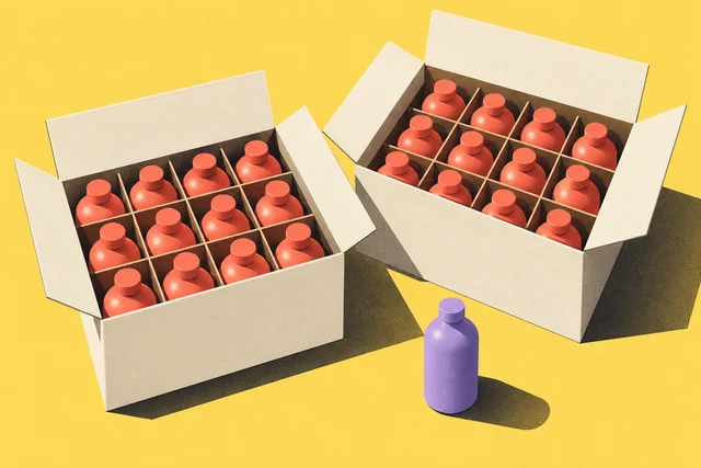
Explain minimum order quantities with clear units, pack sizes and permitted increments, using a checked wholesale example and useful correction messages.
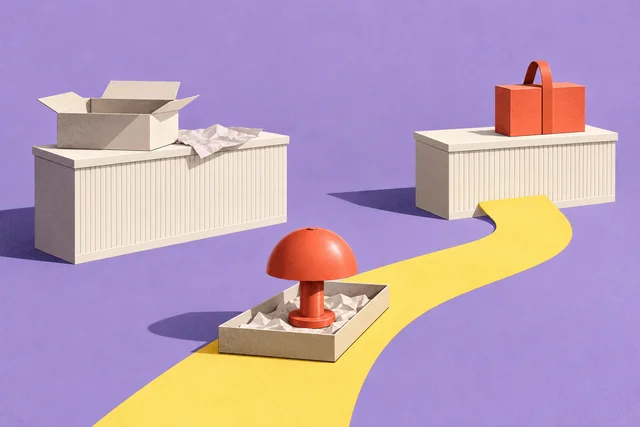
Separate what can be ordered from when it arrives, where it can be collected, and what a return costs.
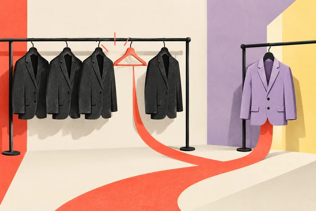
Design useful next steps for unavailable product variants, including restock alerts, alternatives and honest handling of unknown availability.
Distinguish dispatch from arrival, compare Google and Shopify delivery-date rules, and see how handling, cutoffs and weekends change a worked calendar.
Clarify store-specific pickup availability, preparation estimates and ready notifications so buyers know when and where to collect an online order.
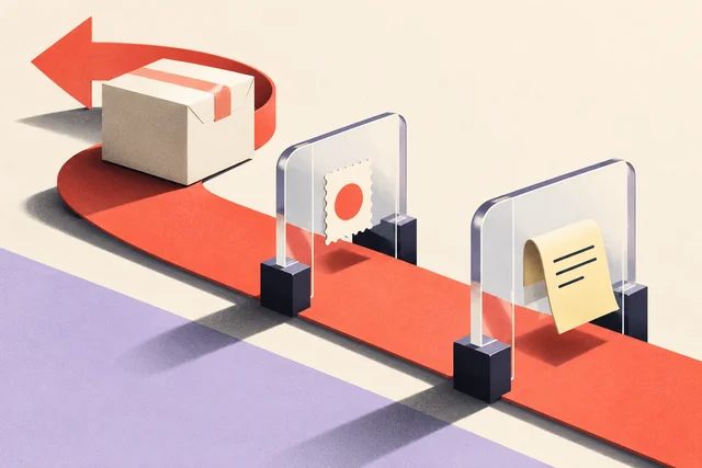
Write a product-specific return summary that explains eligibility, the return window, shipping costs, deductions and refund method before the purchase.
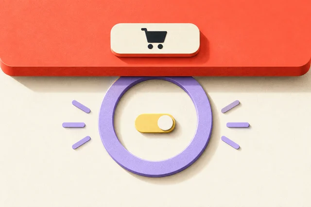
A visible button should not hide the information or controls someone needs next.
Review sticky purchase bars with keyboard navigation, zoom and narrow viewports so the visible action does not cover controls, prices or validation.